Top Ten Tuesday was created by The Broke and the Bookish in June of 2010 and was moved to That Artsy Reader Girl in January 2018. It was born of a love of lists, a love of books, and a desire to bring bookish friends together. Top Ten Tuesday has been one of my favorite memes ever since I started blogging, so huge thanks to Jana for taking over the hosting duties!
This week’s TTT topic is Favorite Books Released In the Last Ten Years (one book for each year). I found this to be a pretty interesting stroll down memory lane just to see how my reading tastes have changed from year to year.
* * * * *
Favorite Books Released in the Last Ten Years
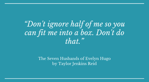
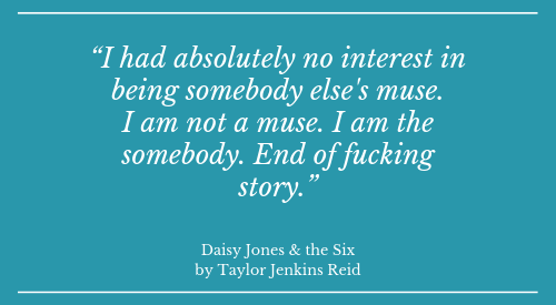
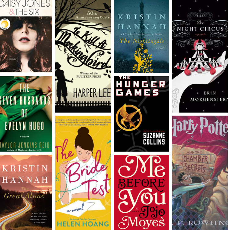
1. Daisy Jones & the Six by Taylor Jenkins Reid
(2019, my favorite so far)

Goodreads Synopsis: Everyone knows Daisy Jones & The Six, but nobody knows the reason behind their split at the absolute height of their popularity . . . until now.
Daisy is a girl coming of age in L.A. in the late sixties, sneaking into clubs on the Sunset Strip, sleeping with rock stars, and dreaming of singing at the Whisky a Go Go. The sex and drugs are thrilling, but it’s the rock and roll she loves most. By the time she’s twenty, her voice is getting noticed, and she has the kind of heedless beauty that makes people do crazy things.
Also getting noticed is The Six, a band led by the brooding Billy Dunne. On the eve of their first tour, his girlfriend Camila finds out she’s pregnant, and with the pressure of impending fatherhood and fame, Billy goes a little wild on the road.
Daisy and Billy cross paths when a producer realizes that the key to supercharged success is to put the two together. What happens next will become the stuff of legend.
The making of that legend is chronicled in this riveting and unforgettable novel, written as an oral history of one of the biggest bands of the seventies. Taylor Jenkins Reid is a talented writer who takes her work to a new level with Daisy Jones & The Six, brilliantly capturing a place and time in an utterly distinctive voice. (Read more…)
2. Children of Blood and Bone by Tomi Adeyemi
(2018)
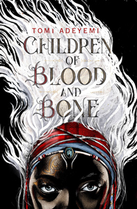
Goodreads Synopsis: They killed my mother. They took our magic. They tried to bury us. Now we rise.
Zélie Adebola remembers when the soil of Orïsha hummed with magic. Burners ignited flames, Tiders beckoned waves, and Zélie’s Reaper mother summoned forth souls.
But everything changed the night magic disappeared. Under the orders of a ruthless king, maji were killed, leaving Zélie without a mother and her people without hope.
Now Zélie has one chance to bring back magic and strike against the monarchy. With the help of a rogue princess, Zélie must outwit and outrun the crown prince, who is hell-bent on eradicating magic for good.
Danger lurks in Orïsha, where snow leoponaires prowl and vengeful spirits wait in the waters. Yet the greatest danger may be Zélie herself as she struggles to control her powers and her growing feelings for an enemy. (Read more…)
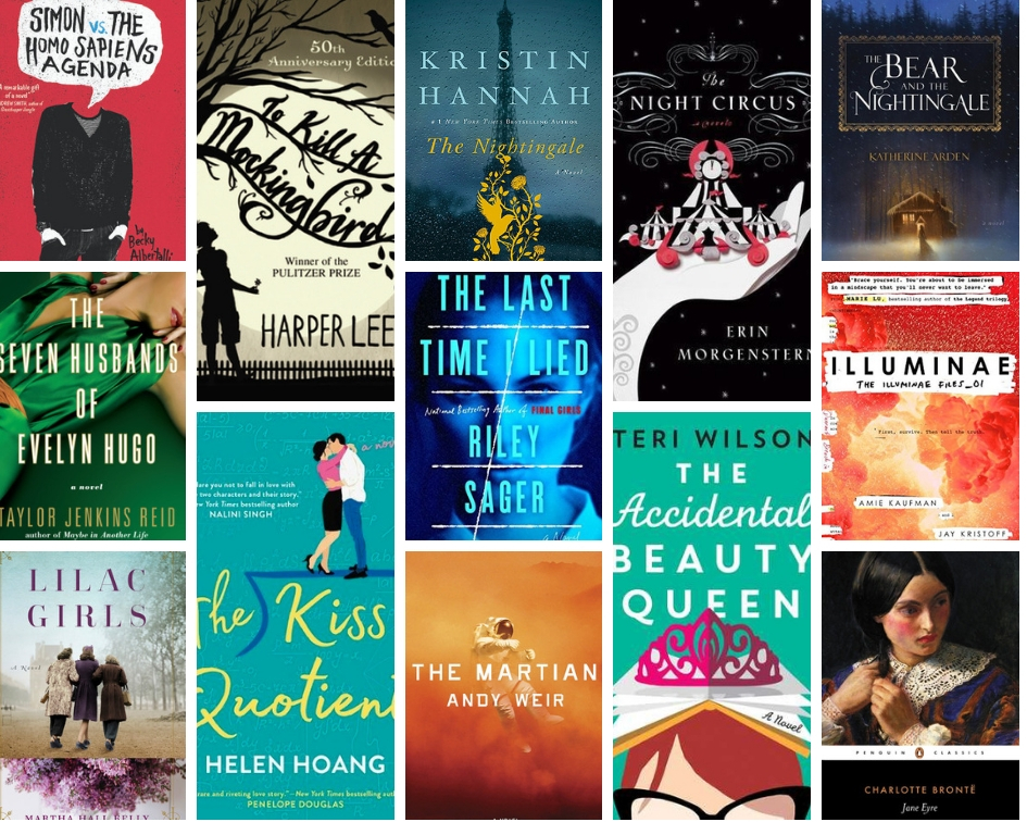
3. The Bear and the Nightingale by Katherine Arden
(2017)
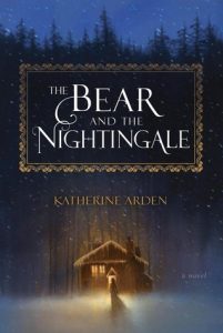
Goodreads Synopsis: At the edge of the Russian wilderness, winter lasts most of the year and the snowdrifts grow taller than houses. But Vasilisa doesn’t mind—she spends the winter nights huddled around the embers of a fire with her beloved siblings, listening to her nurse’s fairy tales. Above all, she loves the chilling story of Frost, the blue-eyed winter demon, who appears in the frigid night to claim unwary souls. Wise Russians fear him, her nurse says, and honor the spirits of house and yard and forest that protect their homes from evil.
After Vasilisa’s mother dies, her father goes to Moscow and brings home a new wife. Fiercely devout, city-bred, Vasilisa’s new stepmother forbids her family from honoring the household spirits. The family acquiesces, but Vasilisa is frightened, sensing that more hinges upon their rituals than anyone knows.
And indeed, crops begin to fail, evil creatures of the forest creep nearer, and misfortune stalks the village. All the while, Vasilisa’s stepmother grows ever harsher in her determination to groom her rebellious stepdaughter for either marriage or confinement in a convent.
As danger circles, Vasilisa must defy even the people she loves and call on dangerous gifts she has long concealed—this, in order to protect her family from a threat that seems to have stepped from her nurse’s most frightening tales. (Read more…)
4. Lilac Girls by Martha Hall Kelly
(2016)

Goodreads Synopsis: Inspired by the life of a real World War II heroine, this debut novel reveals a story of love, redemption, and secrets that were hidden for decades.
New York socialite Caroline Ferriday has her hands full with her post at the French consulate and a new love on the horizon. But Caroline’s world is forever changed when Hitler’s army invades Poland in September 1939—and then sets its sights on France.
An ocean away from Caroline, Kasia Kuzmerick, a Polish teenager, senses her carefree youth disappearing as she is drawn deeper into her role as courier for the underground resistance movement. In a tense atmosphere of watchful eyes and suspecting neighbors, one false move can have dire consequences.
For the ambitious young German doctor, Herta Oberheuser, an ad for a government medical position seems her ticket out of a desolate life. Once hired, though, she finds herself trapped in a male-dominated realm of Nazi secrets and power.
The lives of these three women are set on a collision course when the unthinkable happens and Kasia is sent to Ravensbrück, the notorious Nazi concentration camp for women. Their stories cross continents—from New York to Paris, Germany, and Poland—as Caroline and Kasia strive to bring justice to those whom history has forgotten. (Read more…)
5. The Nightingale by Kristin Hannah
(2015)
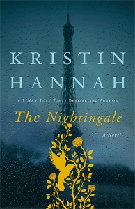
Goodreads Synopsis: In love we find out who we want to be. In war we find out who we are.
France, 1939. In the quiet village of Carriveau, Vianne Mauriac says goodbye to her husband, Antoine, as he heads for the Front. She doesn’t believe that the Nazis will invade France…but invade they do, in droves of marching soldiers, in caravans of trucks and tanks, in planes that fill the skies and drop bombs upon the innocent. When France is overrun, Vianne is forced to take an enemy into her house, and suddenly her every move is watched; her life and her child’s life is at constant risk. Without food or money or hope, as danger escalates around her, she must make one terrible choice after another.
Vianne’s sister, Isabelle, is a rebellious eighteen-year-old girl, searching for purpose with all the reckless passion of youth. While thousands of Parisians march into the unknown terrors of war, she meets the compelling and mysterious Gäetan, a partisan who believes the French can fight the Nazis from within France, and she falls in love as only the young can…completely. When he betrays her, Isabelle races headlong into danger and joins the Resistance, never looking back or giving a thought to the real–and deadly–consequences. (Read more…)
6. Big Little Lies by Liane Moriarty
(2014)
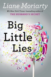
Goodreads Synopsis: Big Little Lies follows three women, each at a crossroads:
Madeline is a force to be reckoned with. She’s funny and biting, passionate, she remembers everything and forgives no one. Her ex-husband and his yogi new wife have moved into her beloved beachside community, and their daughter is in the same kindergarten class as Madeline’s youngest (how is this possible?). And to top it all off, Madeline’s teenage daughter seems to be choosing Madeline’s ex-husband over her. (How. Is. This. Possible?).
Celeste is the kind of beautiful woman who makes the world stop and stare. While she may seem a bit flustered at times, who wouldn’t be, with those rambunctious twin boys? Now that the boys are starting school, Celeste and her husband look set to become the king and queen of the school parent body. But royalty often comes at a price, and Celeste is grappling with how much more she is willing to pay.
New to town, single mom Jane is so young that another mother mistakes her for the nanny. Jane is sad beyond her years and harbors secret doubts about her son. But why? While Madeline and Celeste soon take Jane under their wing, none of them realizes how the arrival of Jane and her inscrutable little boy will affect them all.
Big Little Lies is a brilliant take on ex-husbands and second wives, mothers and daughters, schoolyard scandal, and the dangerous little lies we tell ourselves just to survive. (Read more…)
7. Me Before You by Jojo Moyes
(2013)
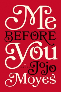
Goodreads Synopsis: Discover the love story that captured over 20 million hearts in Me Before You, After You, and Still Me.
They had nothing in common until love gave them everything to lose . . .
Louisa Clark is an ordinary girl living an exceedingly ordinary life—steady boyfriend, close family—who has barely been farther afield than their tiny village. She takes a badly needed job working for ex–Master of the Universe Will Traynor, who is wheelchair bound after an accident. Will has always lived a huge life—big deals, extreme sports, worldwide travel—and now he’s pretty sure he cannot live the way he is.
Will is acerbic, moody, bossy—but Lou refuses to treat him with kid gloves, and soon his happiness means more to her than she expected. When she learns that Will has shocking plans of his own, she sets out to show him that life is still worth living.
A Love Story for this generation and perfect for fans of John Green’s The Fault in Our Stars, Me Before You brings to life two people who couldn’t have less in common—a heartbreakingly romantic novel that asks, What do you do when making the person you love happy also means breaking your own heart? (Read more…)
8. The Snow Child by Eowyn Ivey
(2012)
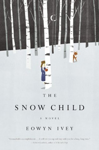
Goodreads Synopsis: Alaska, 1920: a brutal place to homestead, and especially tough for recent arrivals Jack and Mabel. Childless, they are drifting apart–he breaking under the weight of the work of the farm; she crumbling from loneliness and despair. In a moment of levity during the season’s first snowfall, they build a child out of snow. The next morning the snow child is gone–but they glimpse a young, blonde-haired girl running through the trees. This little girl, who calls herself Faina, seems to be a child of the woods. She hunts with a red fox at her side, skims lightly across the snow, and somehow survives alone in the Alaskan wilderness. As Jack and Mabel struggle to understand this child who could have stepped from the pages of a fairy tale, they come to love her as their own daughter. But in this beautiful, violent place things are rarely as they appear, and what they eventually learn about Faina will transform all of them. (Read more…)
9. The Night Circus by Erin Morganstern
(2011)
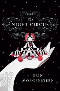
Goodreads Synopsis: The circus arrives without warning. No announcements precede it. It is simply there, when yesterday it was not. Within the black-and-white striped canvas tents is an utterly unique experience full of breathtaking amazements. It is called Le Cirque des Rêves, and it is only open at night.
But behind the scenes, a fierce competition is underway—a duel between two young magicians, Celia and Marco, who have been trained since childhood expressly for this purpose by their mercurial instructors. Unbeknownst to them, this is a game in which only one can be left standing, and the circus is but the stage for a remarkable battle of imagination and will. Despite themselves, however, Celia and Marco tumble headfirst into love—a deep, magical love that makes the lights flicker and the room grow warm whenever they so much as brush hands.
True love or not, the game must play out, and the fates of everyone involved, from the cast of extraordinary circus performers to the patrons, hang in the balance, suspended as precariously as the daring acrobats overhead.
Written in rich, seductive prose, this spell-casting novel is a feast for the senses and the heart. (Read more…)
10. Mockingjay by Suzanne Collins
(2010)
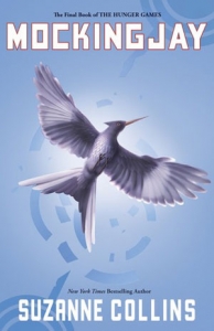
Goodreads Synopsis: My name is Katniss Everdeen. Why am I not dead? I should be dead.
Katniss Everdeen, girl on fire, has survived, even though her home has been destroyed. Gale has escaped. Katniss’s family is safe. Peeta has been captured by the Capitol. District 13 really does exist. There are rebels. There are new leaders. A revolution is unfolding.
It is by design that Katniss was rescued from the arena in the cruel and haunting Quarter Quell, and it is by design that she has long been part of the revolution without knowing it. District 13 has come out of the shadows and is plotting to overthrow the Capitol. Everyone, it seems, has had a hand in the carefully laid plans–except Katniss.
The success of the rebellion hinges on Katniss’s willingness to be a pawn, to accept responsibility for countless lives, and to change the course of the future of Panem. To do this, she must put aside her feelings of anger and distrust. She must become the rebels’ Mockingjay–no matter what the personal cost. (Read more…)
* * * * *
What have been some of your favorite reads over the past 10 year? Do we share any favorites?