Top Ten Tuesday – My Top Ten Favorite Cover Makeovers
Top Ten Tuesday was created by The Broke and the Bookish in June of 2010 and was moved to That Artsy Reader Girl in January 2018. It was born of a love of lists, a love of books, and a desire to bring bookish friends together. Top Ten Tuesday has been one of my favorite memes ever since I started blogging, so huge thanks to Jana for taking over the hosting duties!
This week’s TTT topic is Cover Redesigns I Loved/Hated. Honestly, until I started blogging, with very rare exception, I never noticed how many different covers the same book can have. I knew there were occasionally special anniversary editions, etc. but that was about it. Blogging has been very eye-opening when it comes to book covers, among other things.
Now that I do pay more attention to the different covers out there, I do have some favorites and some where I prefer the earlier version over the newer one.
* * * * *
My Top Ten Favorite (and Not So Favorite) Cover Makeovers
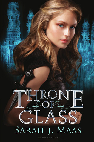
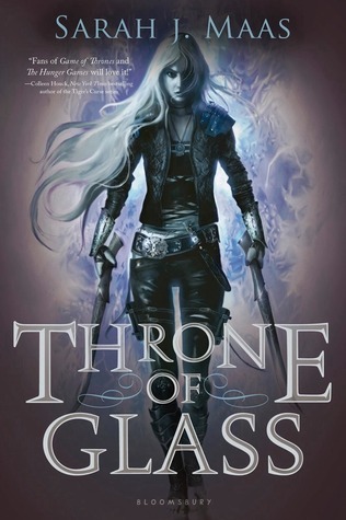
1. Throne of Glass by Sarah J. Maas
The one on the left is the older of the two covers, and I’m not a fan. Celaena just looks too doll-like. I much prefer the fiercer looking cover on the right.
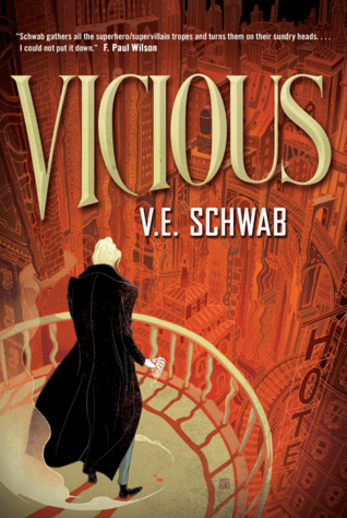
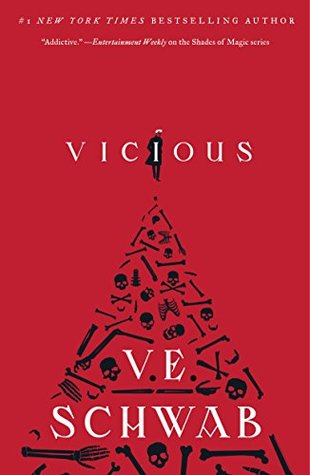
2. Vicious by V.E. Schwab
I’m actually torn on this one because I really like them both. The one on the left is the one I own so I feel very nostalgic towards it and I love how atmospheric it is. That said I also love the vivid red, black, and white on the newer cover, not to mention the skulls and bones all over it. Both of these are winners for me.
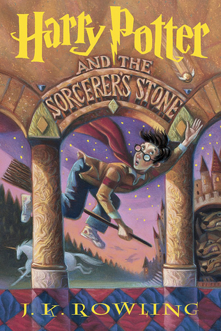
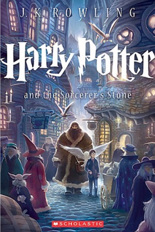
3. Harry Potter and the Sorcerer’s Stone by J.K. Rowling
This is another set of covers I’m torn on. The one on the left is the one I own and I believe the first cover that was issued in the U.S. It’s a great cover and of course there’s that nostalgia factor again. On the other hand though, look how truly gorgeous that cover on the right is. It’s stunning and I honestly think I prefer it to the original.
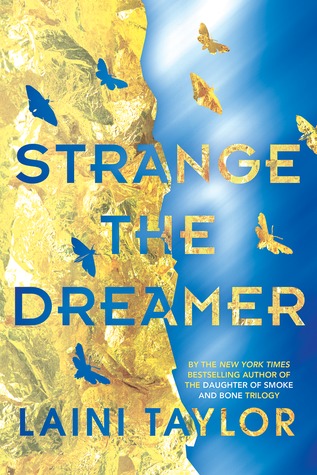
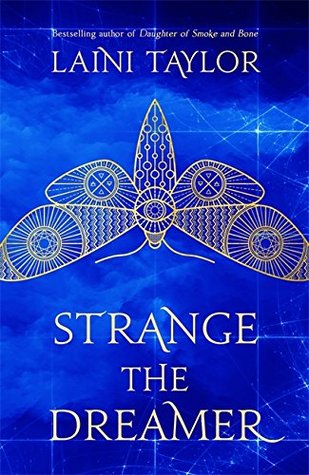
4. Strange the Dreamer by Laini Taylor
This series has actually had me conflicted about its covers as well, both because they changed and because I don’t think any of the versions matched each other well. In the case of the first book though, I think the original on the left is my favorite I do love the blue on each one, but I like the pop of the yellow on the original and I prefer the way the moths look versus the giant one on the other cover.
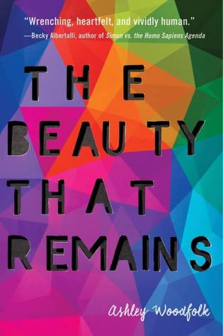
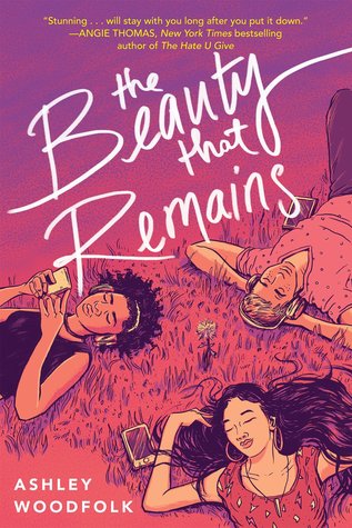
5. The Beauty That Remains by Ashley Woodfolk
Although I really did love the one on the left, which is the original cover,
I do feel like the second one does a better job of conveying what the story is about and what age group it’s geared toward so thumb’s up to the newer cover design.
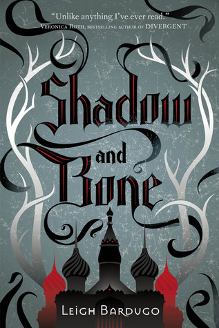
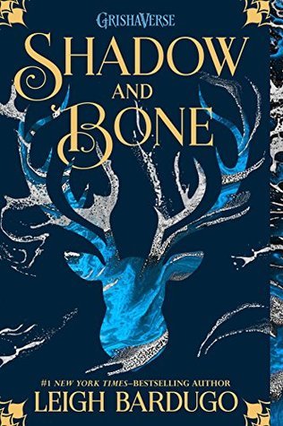
6. Shadow and Bone by Leigh Bardugo
There’s a lot to love about both of these covers. Overall though, I think I prefer the newer cover on the right. I love the colors on that version and on the other two books in the series.
They’re vibrant and eye catching.

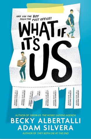
7. What If It’s Us by Becky Albertalli and Adam Silvera
I actually love both versions of this cover too. They’re both just adorable. I do like that the newer cover references their meet cute at the post office though so maybe give a slight edge to that cover.
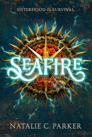
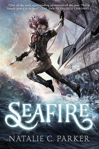
8. Seafire by Natalie C. Parker
This is another where I really love both covers. I love all of the vibrant colors in the original on the left, but how badass does the one on the right look? If I hadn’t already purchased the one on the left, I’d totally prefer to own the one on the right.
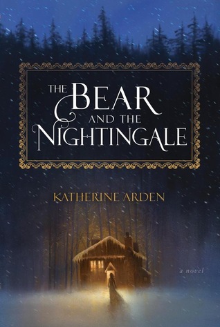
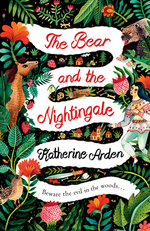
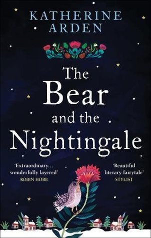
9. The Bear and the Nightingale by Katherine Arden
This is one of my favorite books and if I had it my way, I would own all three versions of the cover. The one on the left is my favorite because I love the atmospheric quality – the glow from the cottage, the snow the night sky, etc. The second one is also gorgeous though and I always find myself staring at it because of all of the amazing details. The third cover is probably my least favorite. It’s still pretty of course but just doesn’t have the special qualities that the first two have.
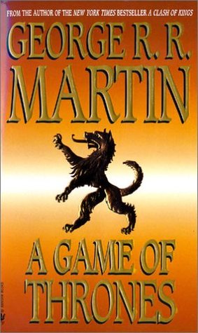
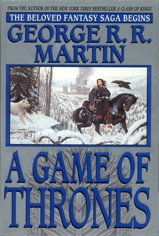
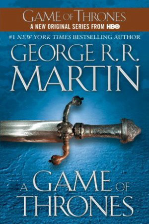
10. A Game of Thrones by George R.R. Martin
I’m sure there are many more versions of this cover out there, but these are the three I see most often. My least favorite of this bunch is the one in the middle. Something about it – the rectangle in the middle, I think – just makes it looks like some dated required reading book for high school. I think if the picture in the rectangle just took up the entire cover, it would be much improved. I think in this case I actually prefer the original on the left with the direwolf on it. The one on the right is nice too but it just screams generic fantasy novel to me, not to mention the ugly HBO advertisement at the top of it.
* * * * *
So there you have it, some of my favorite cover make overs. What are some of your favorites?



The original ToG cover is so cringey. I mean, come on… that is NOT Celaena! LOL
I didn’t know What If It’s Us had received a cover change! I’ve always liked the cover but the new one is awfully cute, too. And I love the nod to their meeting. 🙂
I’m glad I’m not the only one who finds that one cringey, lol.
Great list! Vicious made my list this week, too. The Bear and the Nightingale has had so many pretty covers – I’m not sure which one I like best!
I agree about The Bear and the Nightingale’s covers. I’d really love to own them all just because they’re so pretty.
I have the original Game of Thrones covers, and I like how they all go together with a similar design. I also have the original Harry Potter paperbacks, and while I like them, I feel like every redesign gets better and better, and I want them all!
Right? If I had the room and the money, I’d love to own pretty much all of the HP editions.
I’m still partial to the original Vicious cover, which is the one I own. But I do love the Seafire redesign!
That Seafire redesign is gorgeous!
Love your list! There are a few on here that also made it onto mine, such as Vicious. I actually really like the original cover, although I really like the redesigned one as well. I can’t believe I forgot about The Bear and The Nightingale! I love all three of the covers, but I think my favorite cover for the last two books matches the third one that is shown (but sadly The Girl in the Tower is completely out of print/stock everywhere and now sells for insane prices?! Sad times lol).
My TTT post
Oh wow, that really sucks about The Girl in the Tower being out of print everywhere. Hopefully they’ll do another printing soon.
That new Harry Potter cover is amazing. I love it.
My TTT.
Isn’t it? That’s probably my favorite redesign.
I like the original HP cover for nostalgia, but I do think the newer one is more intense and detailed, which I love. I like the original Strange the Dreamer way more than that new one – the big moth kind of freaks me out. And I agree with you on Vicious – I like both for different reasons.
-Lauren
That moth freaks me out too, lol.
Haha I actually posted the UK cover of The Bear and the Nightingale on my own list…except I like the UK cover better than the US one!
Too funny, lol.
Great covers you’ve selected for comparison, Suzanne! Like you, I have trouble selecting some of them but ultimately agreed with your choices.
This was fun🥰
Thanks!
Throne of Glass- definitely an improvement. And to be honest I love that second Harry Potter cover- it’s just so magical looking. The Seafire covers- wow those are beautiful, but the one on the right is amazing.
I like the middle Game of Thrones one the best, but I think that’s because that’s the one I had originally. 🙂 And I usually like illustraions on fantasy books, but I had never thought about the box design before- I think you’re right, having full artwork instead of being boxed in would be much better!
Right? I’d love to see that photo wrap all the way around the book.
Definitely on the Throne of Glass makeover–that was a great choice on their part to rebrand. I really like both covers for Vicious! I love the illustration of the original and the architecture in it, but the second also is really neat with all the bones. I also genuinely love both Shadow and Bone covers! Though the newer one definitely just feels fresher.
I love both Shadow and Bone covers too. I did pick up copies of the newer ones though just because I love the colors so much.
I have been seeing ToG and Vicious a lot. Though I feel the new ToG is superior to its predecessor, I sort of like both the Vicious covers.
Yes, I honestly like all of the variations of the Vicious cover I’ve seen.
I love the covers you chose to compare, Suzanne, and I had so much fun looking at them and comparing them. I LOVE that middle The Bear in the Nightingale cover too!
It really is gorgeous.
I ahve such a soft spot for the US harry potter covers! And i am so surprised at the difference in the Maas covers — how generic is the older cover ?!
Right? It’s awful. As much as I’m enjoying the series, I don’t know that I would have even given it a chance if I had seen that original cover first.
Schwab has really amazing covers!
Talking about covers I really love Leigh Bardugo and Brenna Yovanoff’s (so creepy), and Seanan McGuire/Mira Grant’s, of course!.
Oooh yes, McGuire’s covers are so great.
I quite like both the old and new cover of Harry Potter. I love how they feature all the magic of the book.
Happy readings! 😉
Right? I actually don’t think I’ve seen a single cover of HP that I didn’t love. Every edition is beautiful in its own way.
OKAY SO IF THIS IS MY SECOND TIME COMMENT I’M SORRY. Also sorry for shouting. I can’t remember if I commented or not or if I lost internet connection while commenting and UGH, I’m a mess. BUT! I am soo with you on Throne of Glass-what a freaking upgrade. The original cover is so awkward and doesn’t fit it AT ALL. I love the newer editions. Both the US print and the UK (I think that’s the one with the white background?) though. Swoon. Annndd, I agree 100% about Shadow and Bone. I love both covers. The newer one has more eye-catching colours for my personal preference so I think they’re my favourite. I’m not drooling I swear.
I agree about the first TOG being awkward. It kind of makes me cringe a little every time I see it, lol.
I’m torn on the Harry Potter covers too. The original cover gives me nostalgia, but I love the magic captured in the newer edition. I love the new Shadow and Bone Trilogy covers because of the symbolism on the cover, and I also like the fiercer-looking new cover for Throne of Glass.
I love the symbols on the new Grishaverse covers too. The originals are beautiful too but I couldn’t resist buying the new ones for my Bardugo collection.
Wow, there are some great covers here, and I agree with you on most of them (especially the ones you are torn on and can’t decide 😂 ) I thought the Throne of Glass cover on the right was the original ones 😂 I like them much better!
I love the newer TOG covers too. They just fit the series so much between than the others.